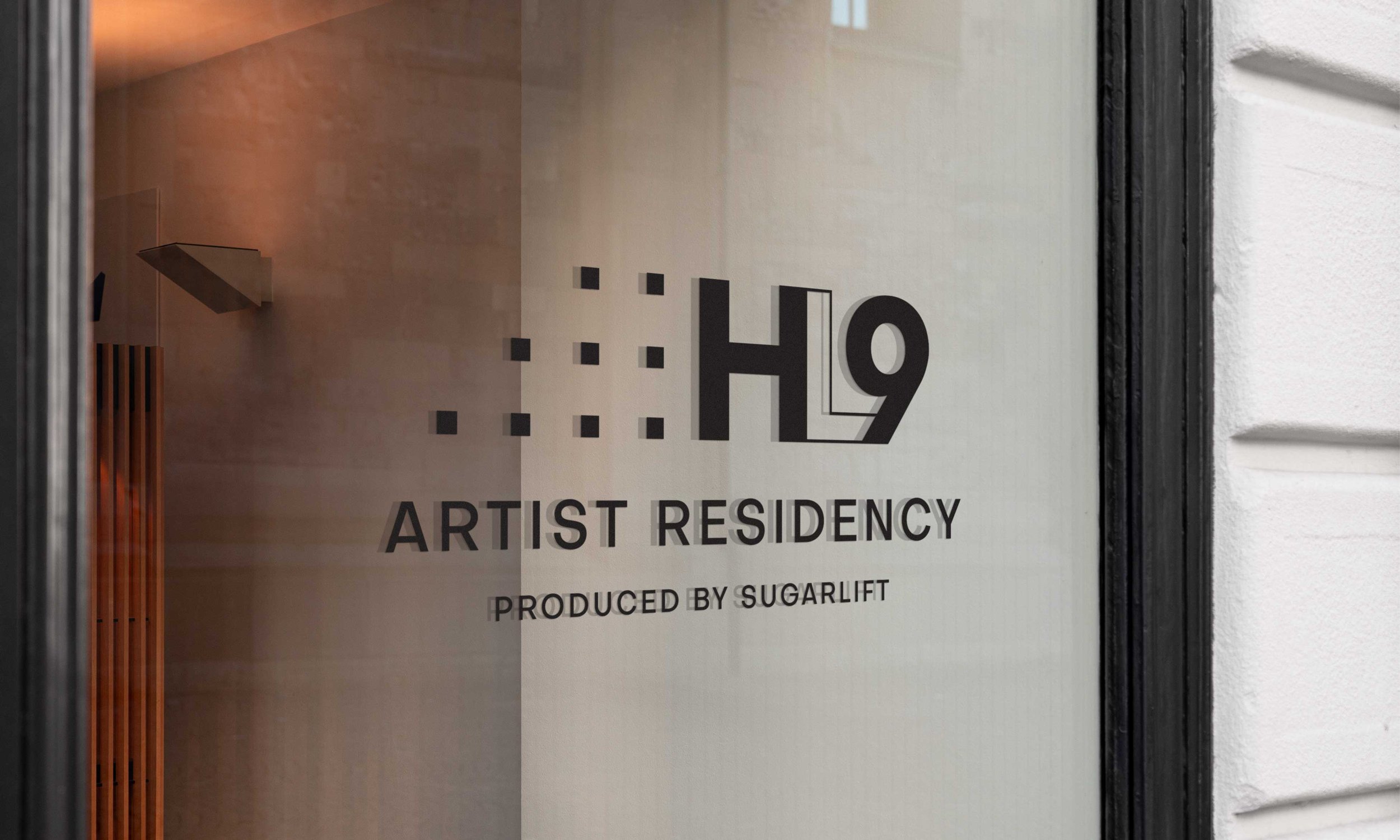
I was asked to design a logo for a residency program hosted by High Line Nine Galleries and produced by Sugarlift in New York City. The design that was ultimately chosen was strongly inspired by High Line Nine’s existing visual identity. The selected logo effectively aligns with the gallery’s established brand while capturing the residency program’s distinctive identity. The following outlines my design process.
High Line Nine
X Sugarlift
Residency Logo
Design Process
To create a more streamlined and symbolic design, I opted to abbreviate 'High Line Nine' to 'HL9.' This concise representation effectively captures the essence of the gallery's name.
I reinterpreted the arrangement of the nine squares in the gallery logo by shifting the top left square to extend the bottom row. This transformation maintained the original concept while also creating a new visual element that represented the ascending steps of the actual High Line.
Text was then positioned below the logo for clarity. I chose to use the font Objectivity for its clean, geometric, and modern appearance, as well as its easy readability.
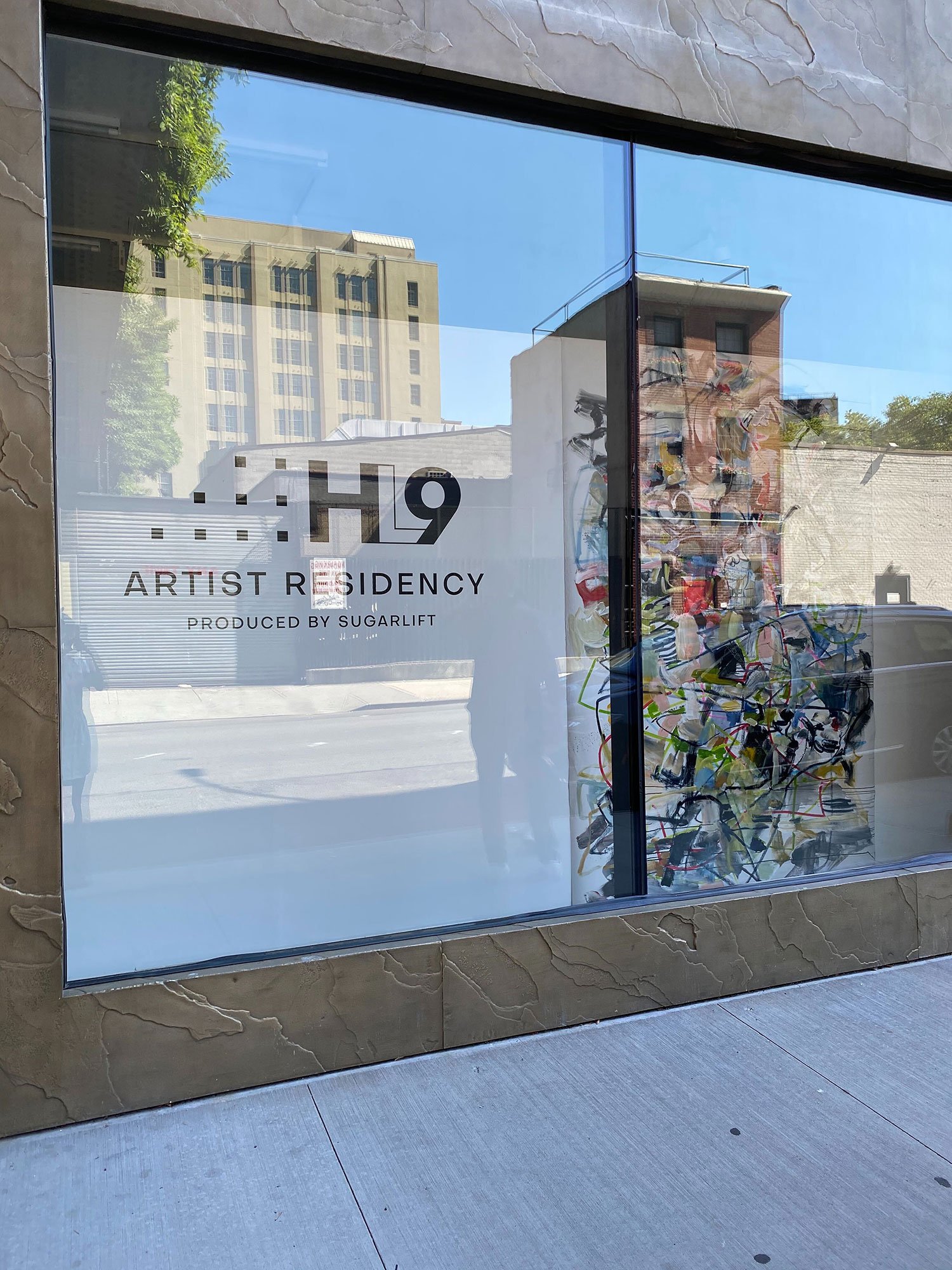
The completed design was then installed on exterior-facing windows as vinyl signage.
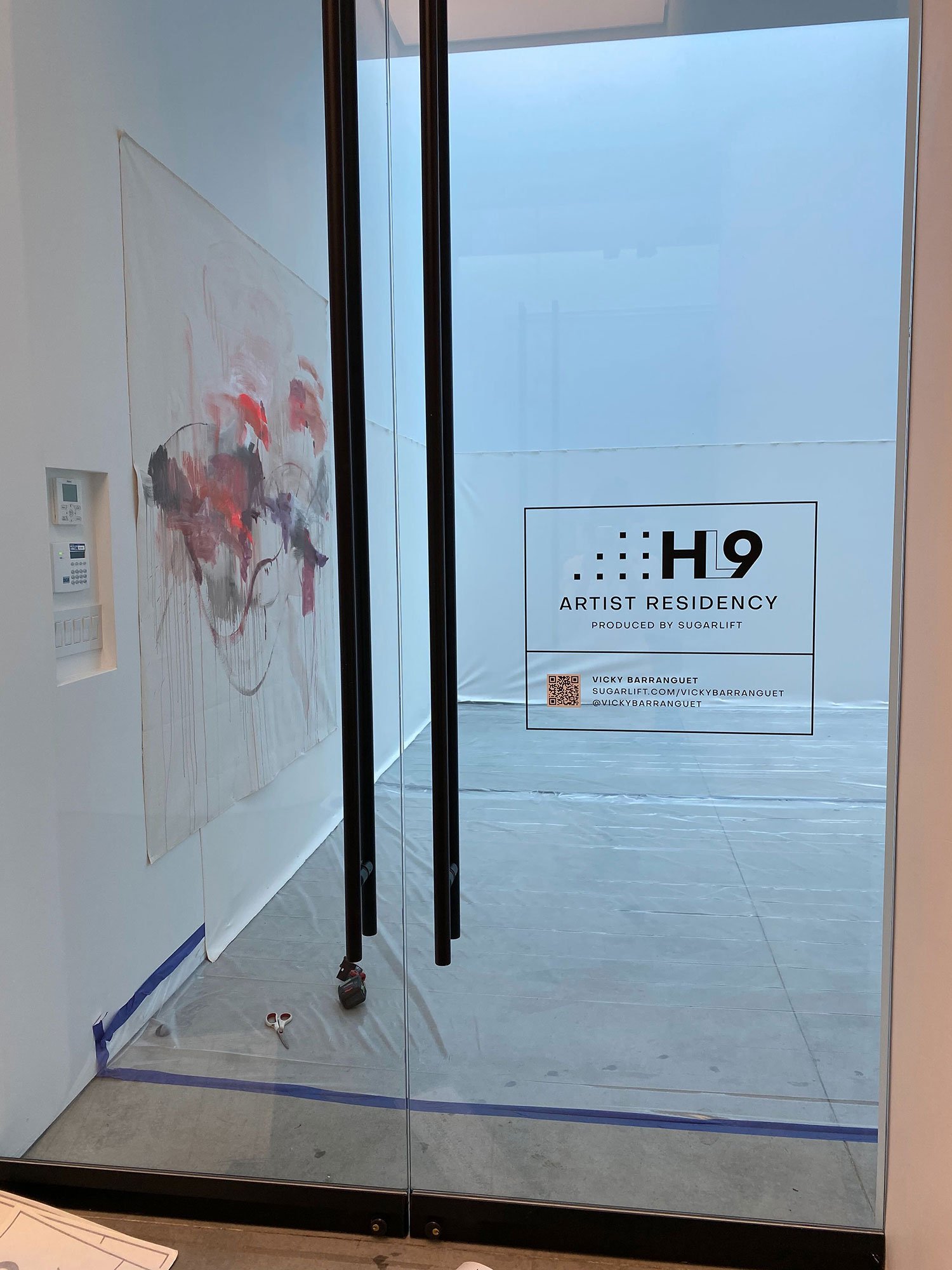
To highlight the individual artists participating in the residency, I created custom signage featuring the final logo. These signs were applied to interior gallery windows to indicate each artist's workspace. Each sign included a QR code linking to more information about the artist and their social media handles for easy engagement.
The square arrangement was positioned to the left of 'HL9' in a manner that mirrored the placement of the squares in the original logo.


